Jefferson County
Council on Aging
The Objective
The objective for this project was to research and develop a new brandmark for Jefferson County Council on Aging to use on their website and in print. This project was both an individual and collaborative effort with my project partner, Paige Herron.

The Solution
Before designing anything, we gathered information from the client and did online research to gain a better understanding of what they were looking for and what their expectations were. We then developed various iterations through rigorous group critiques, further research, collaborating, presenting, and reworking ideas. For my team’s brandmark we decided to lead with a design that was inspired by Colorado’s own blooming native hookless cactus by correlating our client’s values, beliefs, and story to the symbolism that comes with the plant itself.


The Process
Below you can see see some of the process work that went into creating the brandmark. The image on the right is the mindmap for it that we used as a guide to drive our designs. Click on it to enlarge it.

Sketching
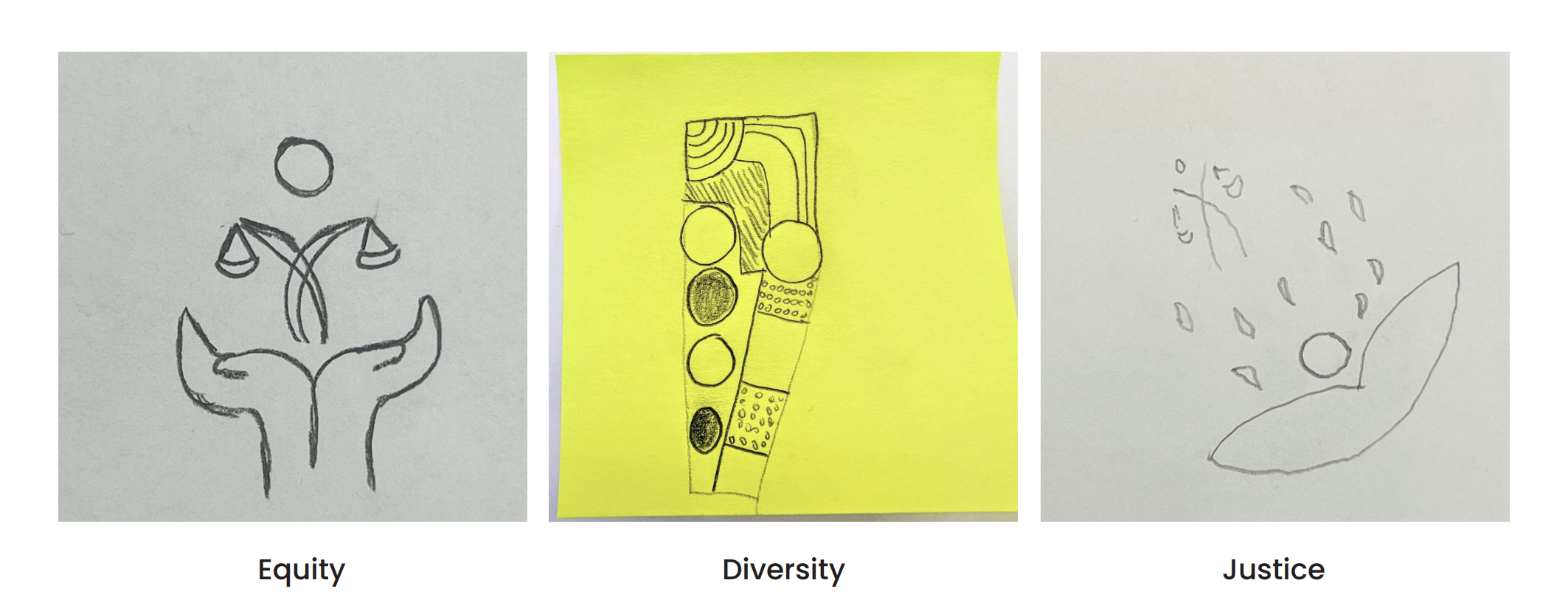
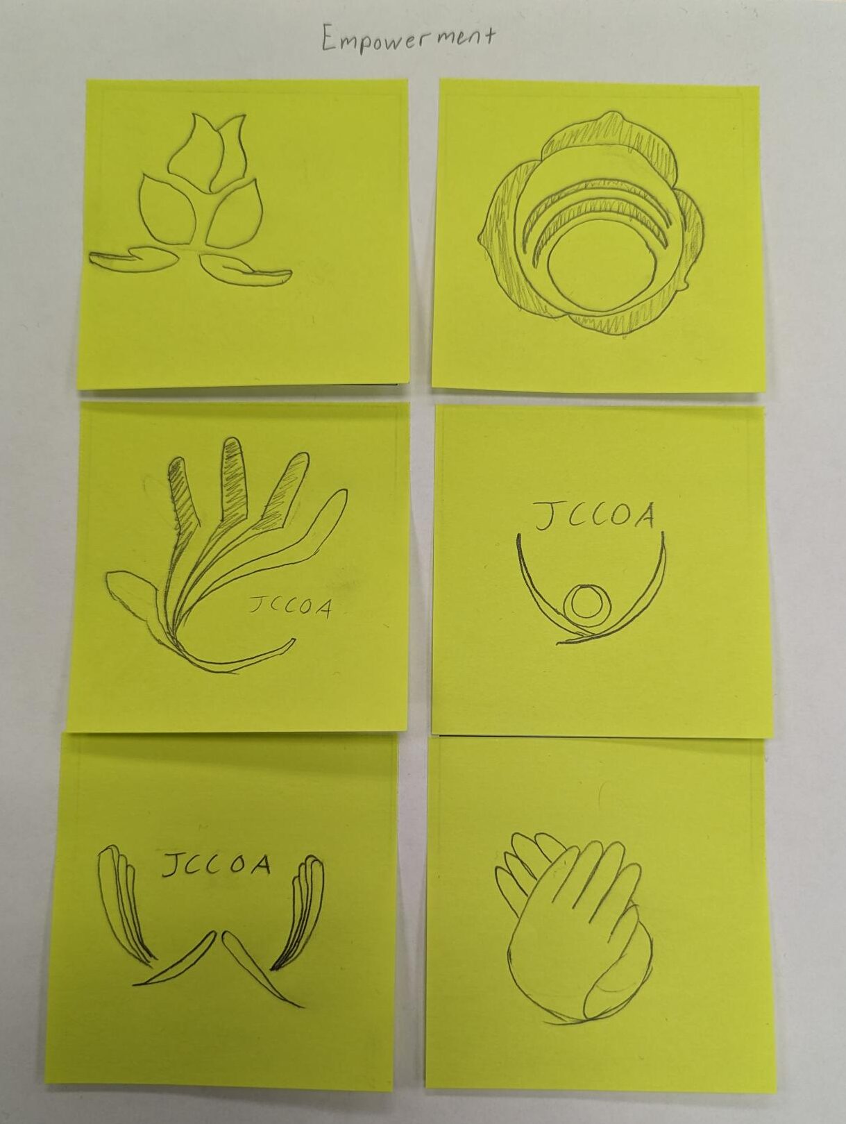
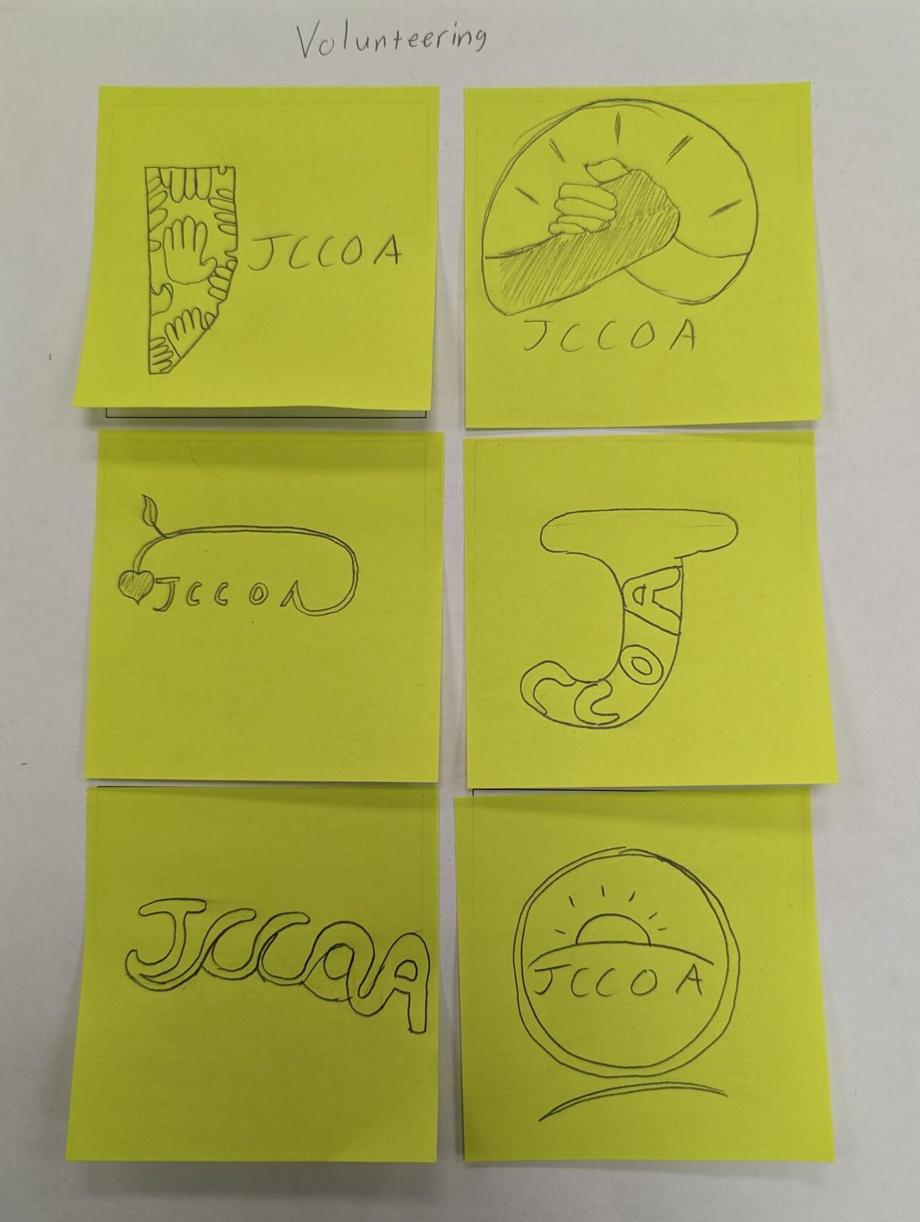
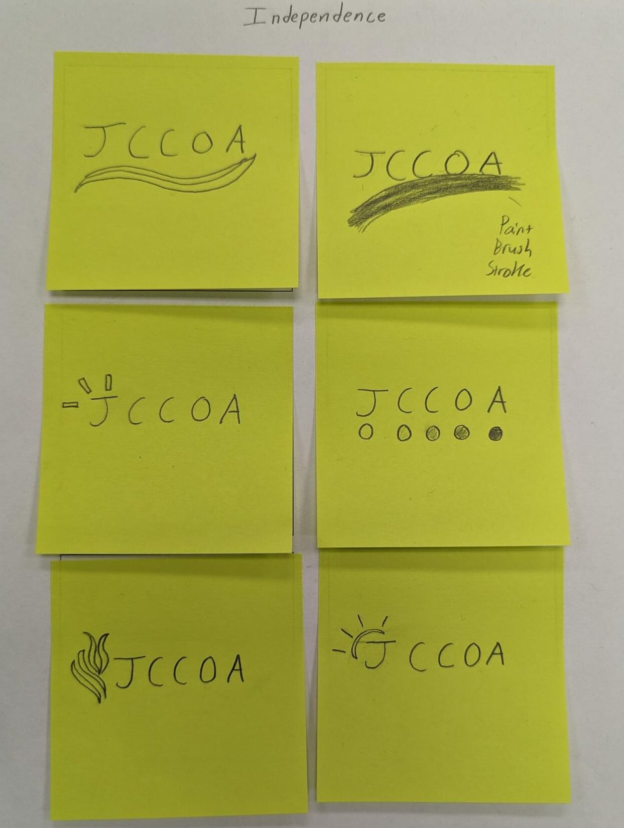
In these concept drafts you will see my experimentation with a variety of elements that I spent time attaching to the theme listed on top of each paper for the first three images by ourselves. The three following landscaped images come from our sketch work after critiquing each other’s drafts to find strengths and weaknesses that we could pull inspiration from in our second round of concept iterations, but this time with a partner to collaborate with. For the second round of critiquing, we had to find a way to incorporate elements from our partner’s first round drafts into the second round.
Digitizing
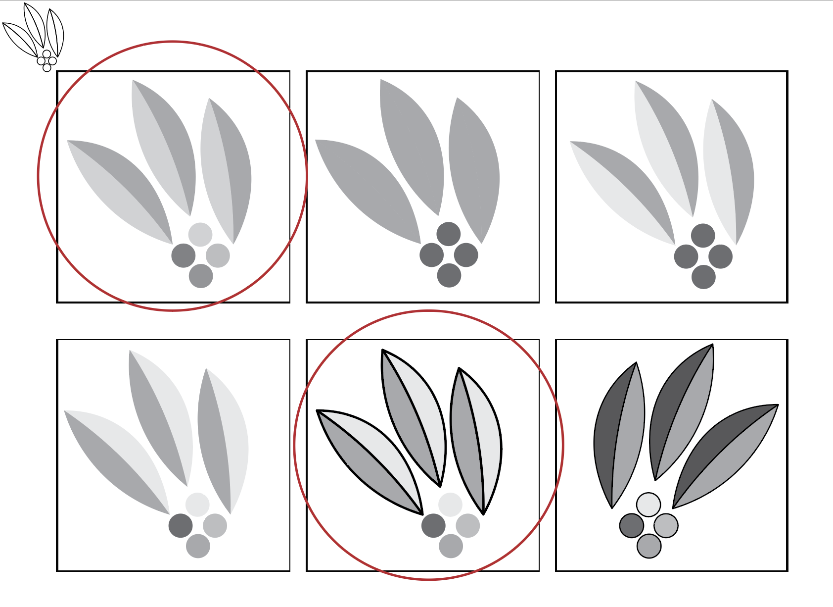
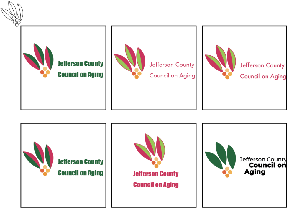
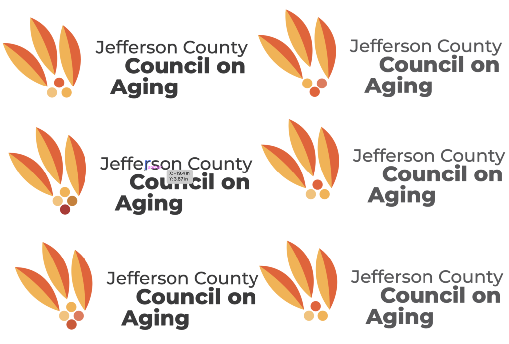
For our digital iterations, we noticed our previous design choices had strong elements, but they weren’t what we were looking for and lacked a sense of identity and relevance to a degree which we were not satisfied with so we looked back to our mind maps and brainstormed a design that was new but incorporates the successful elements we came up with. We agreed on the theme of a blooming hookless cactus plant native to Colorado since we felt that it can make for a strong visual and relate it to our client’s ideals, values and overall concept.
Brandmark Story
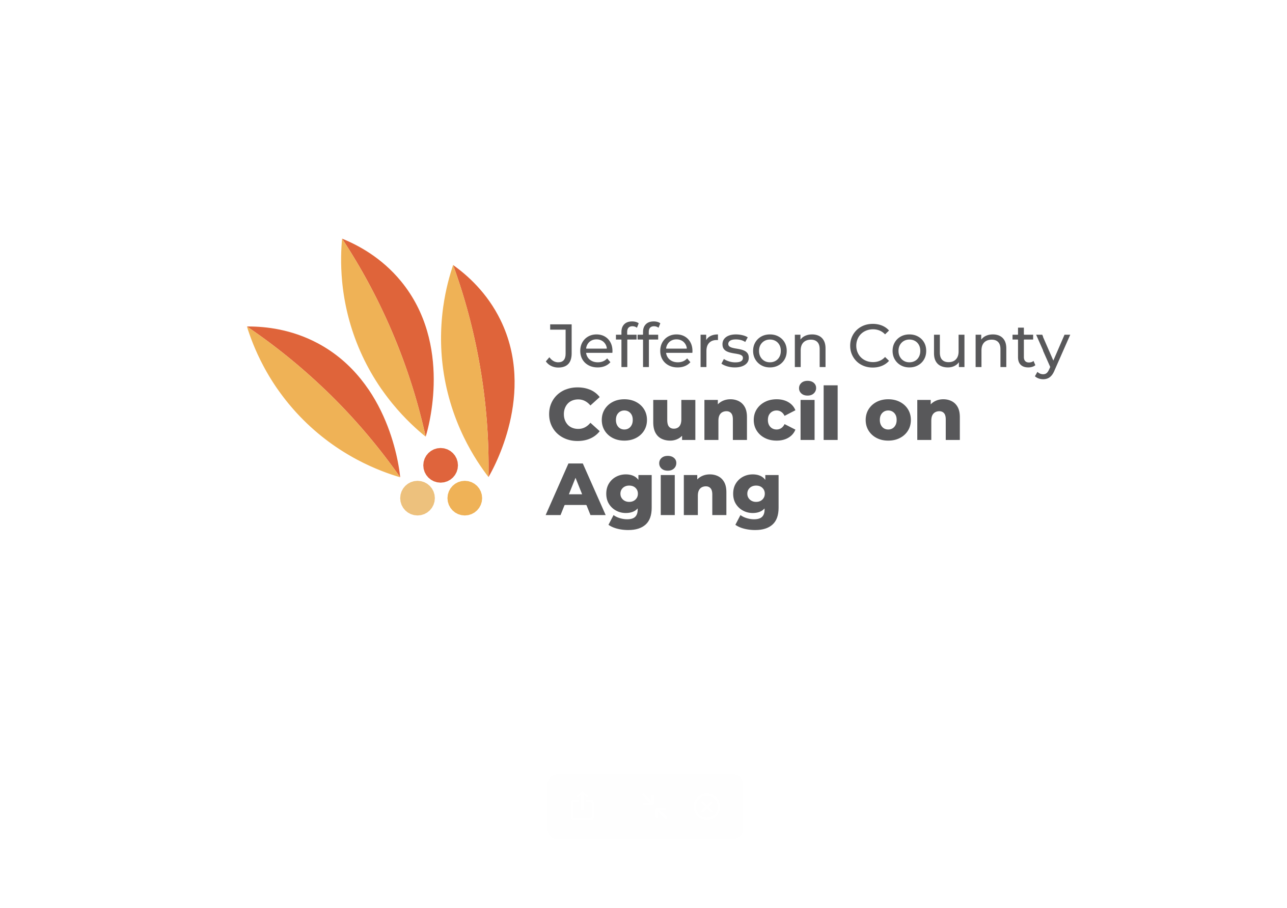
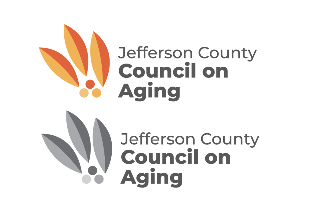
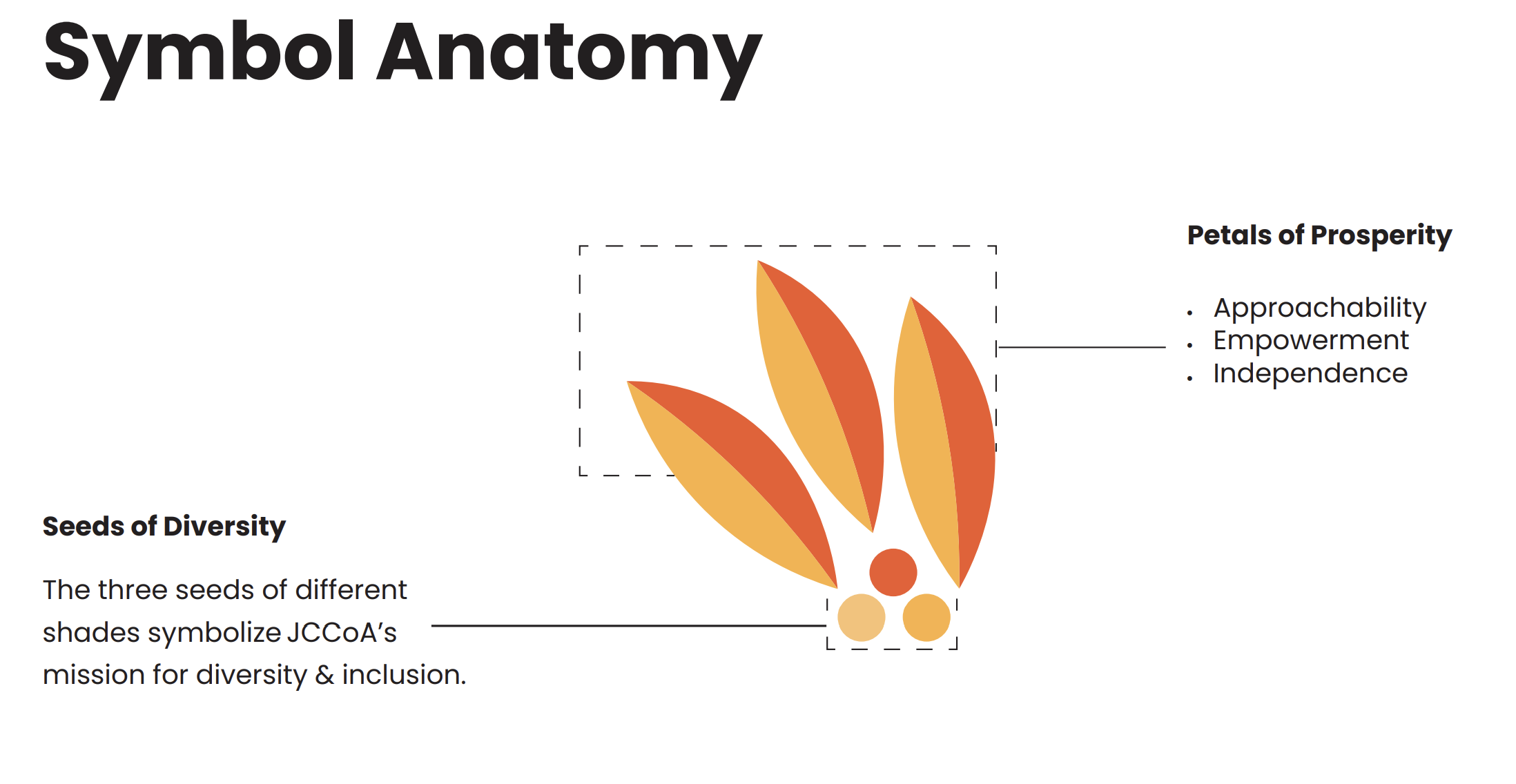
This brandmark is simple, familiar, and recognizable. It is a design that is inclusive. A design that aligns with JCCoA’s values, purpose, and goals. Its story is inspired by Colorado’s own native hookless cacti’s beautiful blooming flowers and its ability to thrive in its environment no matter how harsh, unforgiving or the history it holds prior to its blossoming. The three petals represent JCCOA’s approachability, empowerment, and independence signified through a free flowing yet strong depiction of multicolored petals. The three seeds of different shades symbolize JCCoA’s mission for diversity and inclusion in meeting the needs of older adults in the community further symbolized through the three petals of prosperity providing the opportunities for the seeds to thrive.
Brand Standards
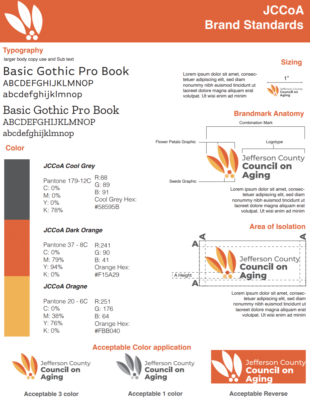
The brand standards we made for the brandmark. Feel free to click on it to expand the image and look at the details.
